ShopDreamUp AI ArtDreamUp
Deviation Actions


Description
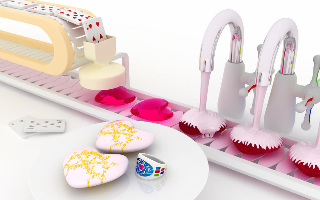
I made this for St. Valentine's day. I'm very glad if this will be a present for you.
I hope for having your wonderful St. Valentine's day.
This is one of WALLPAPERs and CHROMATIC SERIES.
You can get 1920x1200 pixels by download.
This scene has been made by 3dsMAX, Illustrator and Photoshop.
I hope for having your wonderful St. Valentine's day.
This is one of WALLPAPERs and CHROMATIC SERIES.
You can get 1920x1200 pixels by download.
This scene has been made by 3dsMAX, Illustrator and Photoshop.
Image size
1920x1200px 849.63 KB
© 2012 - 2024 k3-studio
Comments114
Join the community to add your comment. Already a deviant? Log In
I enjoy the clean aesthetic of this piece, and I think it's a very sweet and whimsical take on Valentine's Day. That being said, I do have some (hopefully) constructive criticism.
I'm not sure how "realistic" you were trying to aim for in this particular piece, but I'm going to say that the unrealistic parts are what stuck out to me in particular.
For example, I see the cards on the side (3 & 8 of Hearts) that have had their hearts extracted, but where do the cards "pop out" on the machine? They go into the funnel, and the hearts become enlarged/pop out of the bottom, but I don't see anywhere for the cards to go to.
Also, the slats on the bottom of the conveyor belt make me feel like some of the coating should maybe fall through. It seems a little weird to have what looks like a thick, viscous stream falling down from the nozzles and none of it ends up falling through the slats.
I also noticed the ring first, though I'm unsure if that was intentional or not. I feel like the more vibrant colors, the deep blue and rainbow colors on the sides, draw the eye away from the rest of the elements, perhaps detracting from the overall vision. The saturation of the colors on the ring also seems to highlight the pale, almost washed out, tones of the rest of the elements (pale yellow on card conveyor, pink-white "chocolate," white cards, white conveyor belt).
All that aside, I liked the placement of the elements, and the way that you used the space. I think that the perspective you chose is much more effective than if you had made it purely horizontal, going from one edge to the other. The conveyor cutting through from corner to corner creates a great contrast between negative and positive space, while still centering the piece.
I also loved the metallic coating on the faucets/nozzles, and the way that they reflected the colors around them. Your use of reflections is just as stunning as always.