ShopDreamUp AI ArtDreamUp

Deviation Actions


Badge Awards
Description
I have made this scene using pencils at [link]
I like these colorful pencils very much.
Which do you like in Chromatic pencils type 1 and Chromatic pencils type 2?")
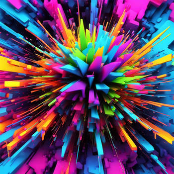
This is one of WALLPAPERs and CHROMATIC SERIES.
You can get a resolution of 1920x1200 by downloading.
This scene has been made by 3dsMAX, Illustrator and Photoshop.
I like these colorful pencils very much.
Which do you like in Chromatic pencils type 1 and Chromatic pencils type 2?
This is one of WALLPAPERs and CHROMATIC SERIES.
You can get a resolution of 1920x1200 by downloading.
This scene has been made by 3dsMAX, Illustrator and Photoshop.
Image size
1920x1200px 538.67 KB
© 2010 - 2024 k3-studio
Comments94
Join the community to add your comment. Already a deviant? Log In
Oh my goodness. You've successfully combined two of my favourite things in this piece: coloured pencils and hearts! Ack. You're a genius.
-- The Good --
I like this piece quite a bit. The pencils are wonderful, the "leads" have a wonderfully rendered glassy look to them, the lines drawn are perfect, the heart looks nice. It has a simple yet effective composition, the reflection of the pencils is a very nice touch. It is an aesthetically pleasing piece overall, and is well done: as is your style.
Overall, this is a very good piece. The concept is great, the colours you used were, overall, great, and it is nice and neat and clean. Everything has its place. Another wonderful piece from =k3-studio.
-- The Bad --
But there are, of course, some things that I don't enjoy too much about this piece. The first are the colours of the pencils. They just seem to not really go together, ofr some reason. The main one that is throwing me off on this one is the red/orange one, but I'm not sure why. I think that just the colour of the yellow next to it makes it a weird colour, but I'm not quite sure why.
The next thing is that I've noticed that your shapes going from the rectangular shape of the pencil to the cone shape of the sharpened part is not smoothly transitioned. It wouldn't bother me so much, but it's so very apparent on the cyan pencil that it just really sticks out. You can also see it on the kinda royal blue pencil, but it's not nearly as obvious, I think. I'm not sure how you could fix that (heck, I haven't gotten into any serious modeling yet), but it's just a weird detail.
Onto the heart. For some reasons the way the colours are blended into it just doesn't work for me. The yellow and green are the ones that are most off: they just seem too dull. The yellow came in at that weird sort of brownish colour you get when you darken it, and the green just is the wrong shade of green. They seem too dull compared to the other colours around it. The pink, that vibrant blue/purple thing going on there, the purple. They just seem out of place in the colour scheme inside of the heart. If you had maybe made the green closer to a light mint colour and changed the yellow for something else, it probably would have worked, but I think the colours you chose insode of them are a little on the dull side.